
Environmental justice mapping tools help you visualize and analyze spatial data to pinpoint communities heavily impacted by pollution and hazards. By layering information like air and water quality, demographics, and industrial sites, you can spot patterns of injustice, uncover hidden risks, and support targeted action. These tools empower you to communicate complex issues clearly, engage communities effectively, and advocate for policy changes. Keep exploring, and you’ll discover how these maps can amplify your efforts for environmental equity.
Key Takeaways
- Environmental justice mapping tools visualize pollution, hazards, and demographic data to identify disproportionately impacted communities.
- These tools empower residents and advocates by making complex environmental data accessible and understandable.
- Combining multiple data layers reveals hidden patterns of environmental injustice and neighborhood risks.
- They support policy advocacy by providing visual, evidence-based insights to push for equitable regulations and interventions.
- Visual mapping enhances community engagement, fostering participation, ownership, and informed decision-making in environmental justice efforts.

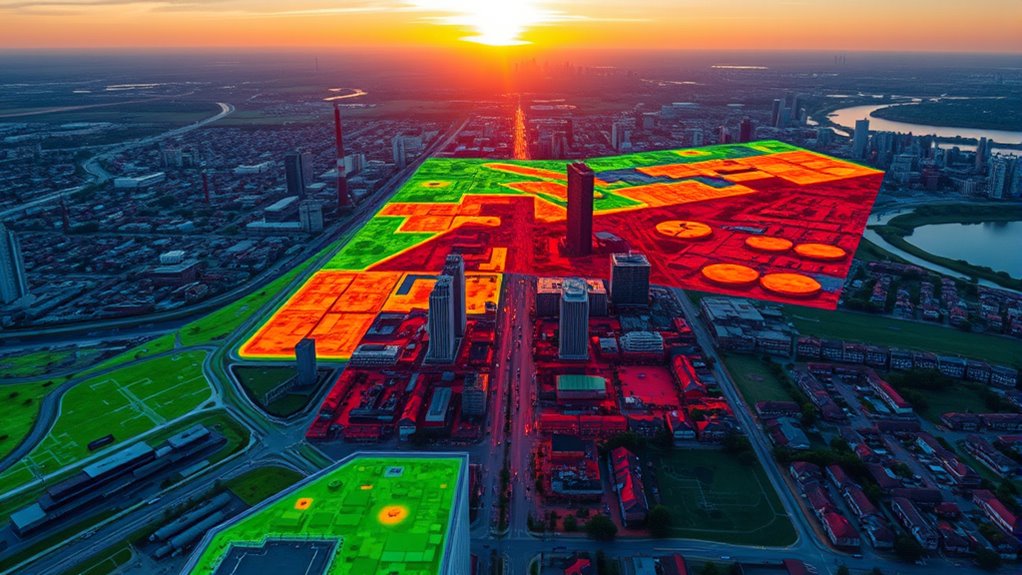
Environmental justice mapping tools are vital resources that help communities and advocates identify areas disproportionately affected by pollution, health risks, and environmental hazards. By visualizing data spatially, these tools empower you to see where vulnerable populations face the greatest environmental burdens. This insight is essential for fostering community engagement, as residents can better understand how pollution impacts their neighborhoods and rally together for change. When you use mapping tools to highlight disparities, you’re giving voice to those often unheard, helping them participate actively in decisions that affect their health and environment. These tools bridge the gap between affected communities and policymakers, providing concrete evidence to support policy advocacy efforts.
Environmental justice mapping reveals disparities, empowering communities and advocating for equitable policies through visualized data.
With the ability to layer multiple data sources—such as air and water quality, proximity to industrial facilities, and demographic information—you can uncover patterns of environmental injustice that might otherwise go unnoticed. This all-encompassing view makes it easier to communicate complex issues to policymakers, community members, and stakeholders. You can demonstrate how certain neighborhoods consistently face higher pollution levels, making a compelling case for targeted interventions or stricter regulations. As a result, your advocacy becomes more strategic and impactful, grounded in data that reflects real-world conditions.
Using environmental justice mapping tools also enhances community engagement by making data accessible and understandable. When residents see concrete visualizations of environmental hazards, they’re more likely to participate in discussions, attend meetings, and advocate for change. These tools often include user-friendly interfaces that allow community members to explore data themselves, fostering a sense of ownership and agency. This participatory approach ensures that solutions are rooted in the lived experiences of those most affected, making policies more equitable and effective.
Furthermore, these mapping tools support policy advocacy by providing evidence-based arguments that can influence legislation and regulation. When you present clear, compelling maps showing disparities, it becomes easier to push for policies that prioritize environmental justice. Whether it’s advocating for buffer zones around industrial sites, stricter emissions standards, or cleanup programs, visual data strengthens your case. It also helps in holding corporations and government agencies accountable, as the data reveals environmental injustices that demand action.
environmental justice mapping software
As an affiliate, we earn on qualifying purchases.
As an affiliate, we earn on qualifying purchases.
Frequently Asked Questions
How Accurate Are Environmental Justice Mapping Tools?
Environmental justice mapping tools are generally accurate but have limitations. They rely on available data, which may have gaps, and technical limitations can affect precision. You should be aware of data privacy concerns, as sensitive information might influence results or restrict data access. While these tools provide valuable insights, they’re not perfect, so use them alongside other sources and always consider their potential inaccuracies.
Can These Tools Predict Future Environmental Risks?
Environmental justice mapping tools can help you anticipate future environmental risks by analyzing climate change impacts and urban planning factors. While they provide valuable insights, they aren’t crystal balls. You can use them to identify vulnerable areas and plan proactively, but remember that predictions depend on current data and assumptions. Stay updated with latest research, and combine these tools with community input to effectively prepare for future environmental challenges.
Who Can Access and Use These Mapping Tools?
You can access and use these mapping tools if you’re part of a community, researcher, or policymaker. Your involvement supports community engagement and helps inform policy implications. These tools are often available online, allowing you to visualize environmental risks and disparities. By participating, you contribute to more equitable decision-making, ensuring that vulnerable communities’ voices are heard and that policies address real environmental justice concerns.
Do These Tools Consider Socio-Economic Factors?
Did you know that over 60% of environmental justice issues are linked to socio-economic bias? These mapping tools definitely consider socio-economic factors, helping you see how disadvantaged communities face heightened environmental risks. They promote community engagement by highlighting areas needing urgent attention, ensuring your efforts target vulnerable populations. By addressing socio-economic bias, these tools empower you to make more equitable decisions and foster inclusive, community-driven solutions.
How Frequently Are the Data Updated in These Tools?
You’ll find that the data refresh rate varies among environmental justice mapping tools. Some update their data weekly or monthly, ensuring you get recent information, while others might only refresh annually or less frequently. The update frequency depends on the tool and the data sources it uses. To stay current, check each tool’s documentation or update schedule, so you know how recent the data you’re working with truly is.
Conclusion
With these environmental justice mapping tools, you hold the compass to fairness and equity, guiding you through the tangled forest of disparities. They light the path like a lantern in the shadows, revealing hidden truths and empowering action. By harnessing their power, you become a navigator, steering communities toward a brighter, more just horizon. Together, you can turn the map into momentum, transforming data into change and hope into reality.